|
The New York Times' Narrative, Mapped OutChris MenahanInformationLiberation May. 22, 2019 |
Popular 
Only 15 Senators Vote to Block Arms to Israel, Despite Majority of Americans Wanting Aid to End

IDF Gunned Down Gaza Paramedics in Clearly Marked Emergency Vehicles, Recovered Video Shows

Key October 7th 'Mass Rapes' Witness Featured in Sheryl Sandberg Film 'Exposed as a Serial Liar'

Rabbi Tells Senate Hearing It's 'Not Enough' to Be 'Not Anti-Semitic' - 'One Must Be Anti-Anti-Semitic'

Sen. Schumer: 'My Job is to Keep the Left Pro-Israel'
 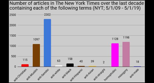 The New York Times' narrative becomes quite clear when you compile a chart showing how many articles they've written over the past decade containing various prejudice-related terms. The New York Times' narrative becomes quite clear when you compile a chart showing how many articles they've written over the past decade containing various prejudice-related terms.Blogger Audacious Epigone shared the above chart over the weekend. The New York Times used to have a feature called "Chronicle," which mapped out what percentage of Times articles included specific words over the years, just as in the chart above. It produced charts such as this: 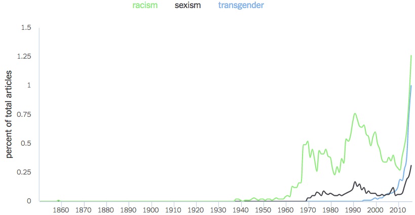 The Times pulled the feature shortly after it was released. Follow InformationLiberation on Twitter, Facebook, Gab and Minds. |