|
The New York Times' Narrative, Mapped OutChris MenahanInformationLiberation May. 22, 2019 |
Popular 
Claim Jewish Student Was 'Stabbed In The Eye' by Pro-Palestine Protester Draws Mockery After Video Released

Mistrial Declared in Case of Arizona Rancher Accused of Killing Migrant Trespasser

Sen. Hawley: Send National Guard to Crush Pro-Palestine Protests Like 'Eisenhower Sent the 101st to Little Rock'

Senate Passes $95B Giveaway to Israel, Ukraine, and Taiwan, Combined With TikTok Ban

AP: 'Israeli Strikes on Gaza City of Rafah Kill 22, Mostly Children, as U.S. Advances Aid Package'
 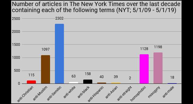 The New York Times' narrative becomes quite clear when you compile a chart showing how many articles they've written over the past decade containing various prejudice-related terms. The New York Times' narrative becomes quite clear when you compile a chart showing how many articles they've written over the past decade containing various prejudice-related terms.Blogger Audacious Epigone shared the above chart over the weekend. The New York Times used to have a feature called "Chronicle," which mapped out what percentage of Times articles included specific words over the years, just as in the chart above. It produced charts such as this: 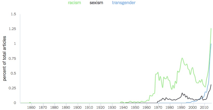 The Times pulled the feature shortly after it was released. Follow InformationLiberation on Twitter, Facebook, Gab and Minds. |